Bringing precision and care back to Blue Bottle's digital experience
A 16-week design systems project consolidating Blue Bottle Coffee's fragmented UI patterns, fixing critical accessibility failures, and building an unofficial design system named after the very brewing method that defines the brand.
The problem: a brand built on precision, with a digital experience that wasn't
Blue Bottle Coffee has built its identity on precision and care. Every pour-over is intentional. Every bean is sourced thoughtfully. The in-store experience reflects those values in every detail. Their digital experience doesn't.
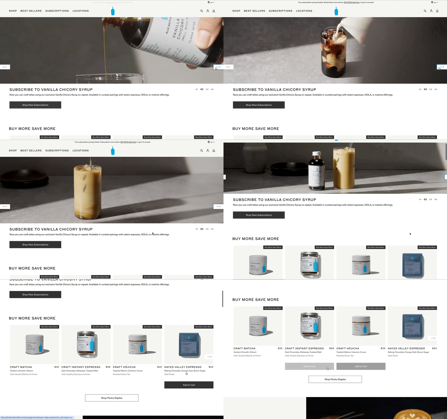
We chose Blue Bottle because it seemed like a brand without a design system, and that was exactly the kind of challenge we wanted to take on. When we audited the site, the gap between the brand's physical warmth and its online presence became clear almost immediately.
- Inconsistency. Across the site, similar UI elements were built differently. Carousels existed in five variations, dropdowns in six. Buttons, headers, and product cards had each been created in isolation, without shared standards.
- Accessibility failures. The site had critical WCAG 2.2 violations, including invalid ARIA labels on pagination, auto-playing video with no pause controls, and color contrast ratios as low as 1.54:1 against a required 4.5:1.
- Decision tax. Without a shared system, every new feature required designers and developers to start from scratch. Too much time went into deciding what to use rather than building something.
The root cause behind all three: there was no single source of truth. No shared standards. Teams working in silos, each making independent decisions that quietly eroded the experience over time.
Deconstructing the interface before designing anything
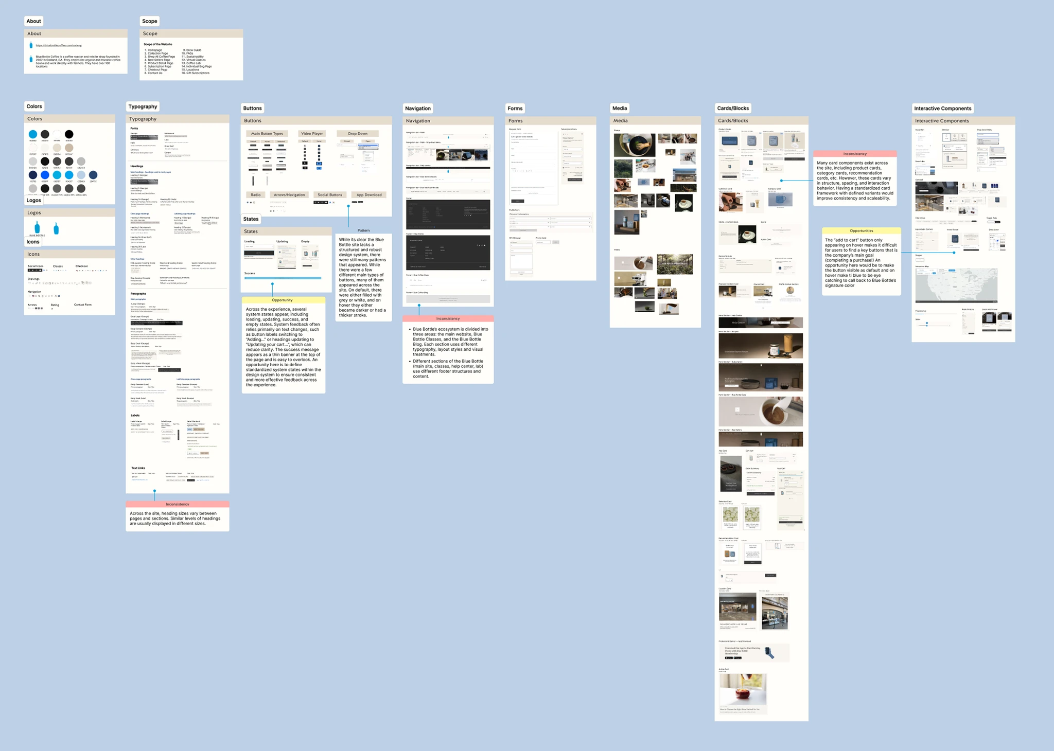
Before designing anything, we audited what already existed, cataloguing every component on the Blue Bottle site and documenting how many versions of each one had accumulated.
What we found was telling: five carousel variants, six dropdowns, four category card styles, multiple button systems with no clear hierarchy, and a product label system with no defined rules at all. The inventory gave us two things: evidence of the problem, and a map of what needed to be consolidated.
Introducing Pour Over
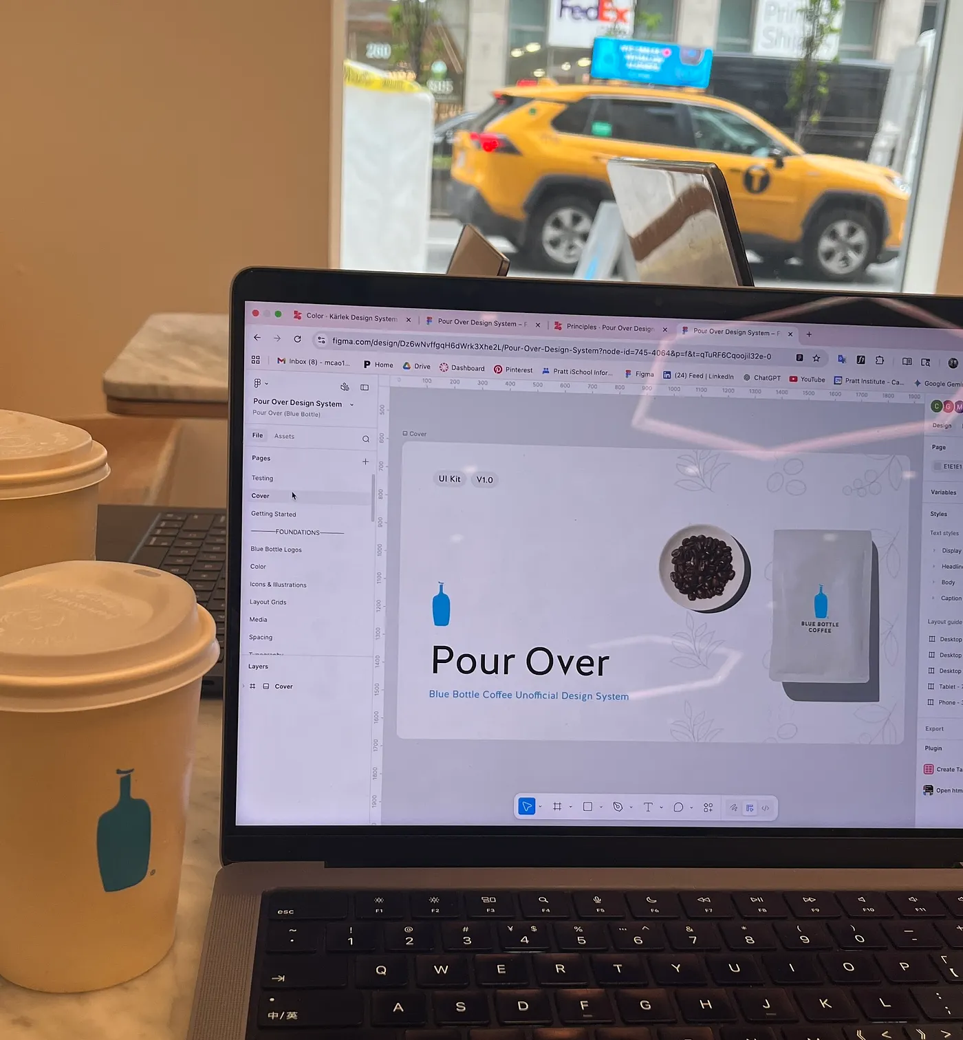
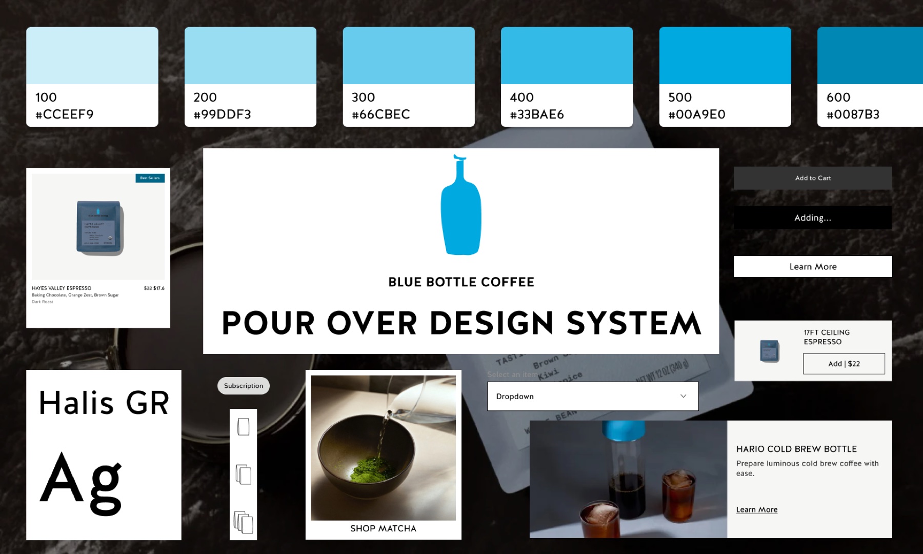
A pour-over demands precision, patience, and attention to every step. We named our system after it, and built it to bring those same qualities to Blue Bottle's digital product.
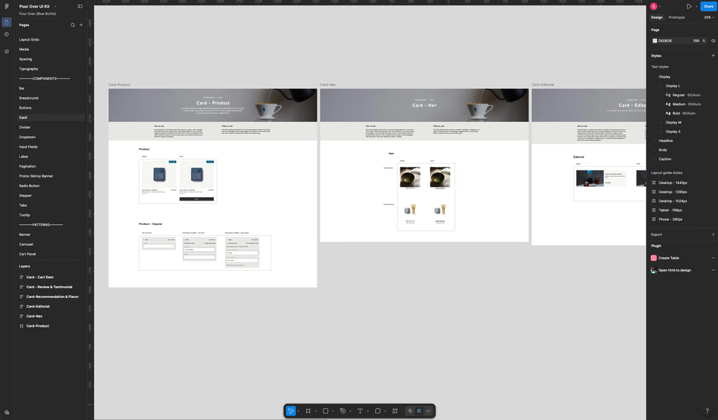
- Figma UI Kit. A comprehensive, reusable component library, 14 components and 9 patterns, that designers can pull from directly instead of building each element from scratch.
- Centralized documentation. A live site built in Zeroheight that serves as the single source of truth, with getting-started guides, component-by-component usage instructions, accessibility guidelines, and do/don't visuals.
- Accessibility built in. Every component follows WCAG 2.2 AA standards, with text color ratios that pass AAA contrast requirements and guidance for motion, ARIA, and focus states documented alongside each piece.
Four principles guided every decision
To connect the digital experience back to Blue Bottle's physical one, we grounded the system in four principles.
- Calm Clarity. Typography, spacing, and layout work together to create structure and rhythm. Every element communicates simply and consistently across contexts, because clarity creates ease.
- Care and Intention. Components are reused with purpose, refined over time, and built as lasting patterns that scale without excess. Nothing is arbitrary.
- Designed for All. Accessibility and inclusivity are fundamental, not additive. The system is built with empathy for a wide range of users, ensuring experiences are usable, clear, and equitable from the foundation up.
- Cafe Warmth. Approachable language, honest imagery, and subtle interactions create a sense of comfort and connection, helping users feel at ease and confident in their choices.
Building shared foundations before components
Rather than redesigning screens one by one, we focused on building a flexible system that could scale across Blue Bottle's evolving ecosystem, starting with the foundational layer.
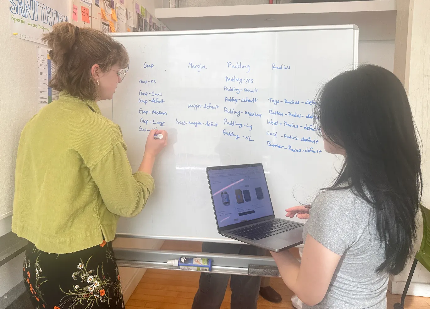
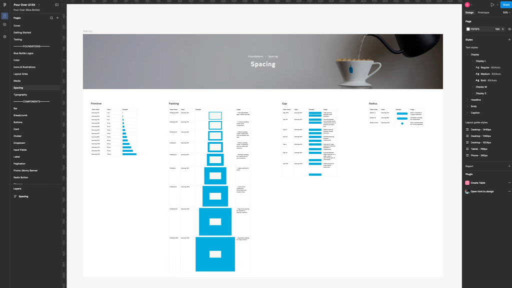
We began with layout grids, spacing, typography, color, media, icons, and illustrations, establishing a shared visual language that reusable components could consistently build upon. To keep the system intuitive for designers and developers alike, we structured our design tokens using Figma Variables instead of relying on inconsistent naming or raw values, creating a clear relationship between brand styles, semantic meaning, and implementation.
Consolidating redundant patterns to reduce complexity
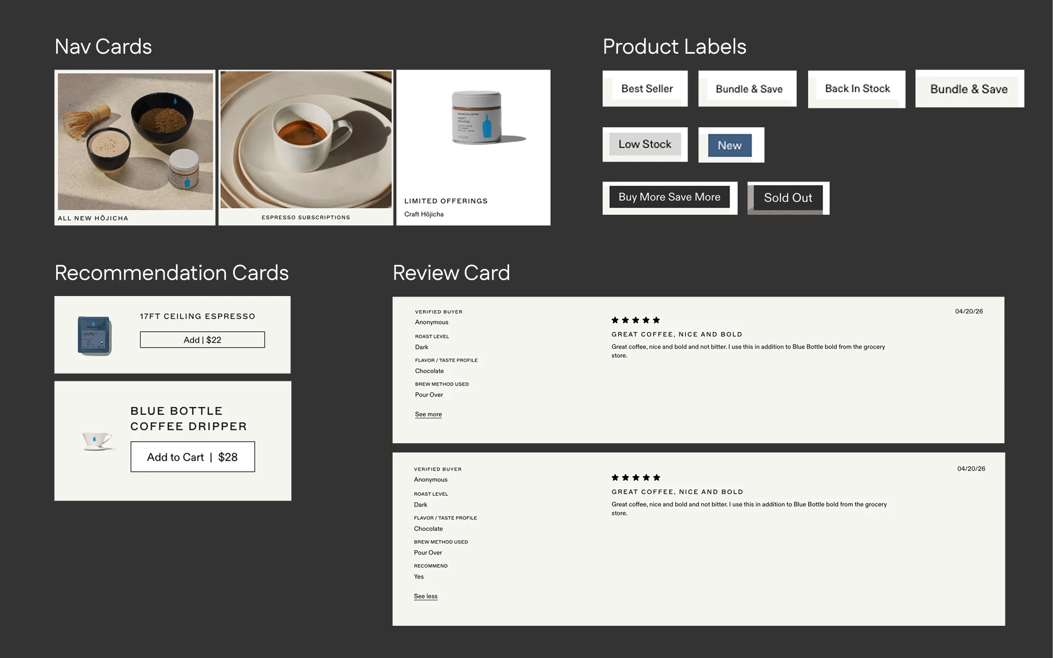
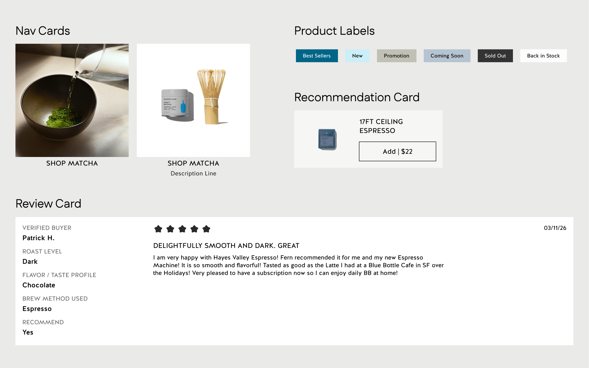
The audit surfaced a huge amount of duplicated and overlapping UI: multiple dropdown variants, fragmented card systems, inconsistent navigation structures, overlapping banner layouts, and unclear label logic across the site.
The carousel is a good example. Five versions existed on the site; we consolidated them to two, each with a defined use case. The goal was never to document every existing variant, but to decide which ones actually needed to exist and eliminate the rest. That same deliberate reduction happened across the entire library.
Testing the UI kit like a real product
A design system is only as good as whether people can actually use it, so we usability tested the kit itself. We asked four users to recreate the homepage, the espresso collection page, and a product detail page using only the Pour Over UI Kit, thinking out loud as they worked.
- 4 of 4 users found the token system intuitive and easy to apply consistently.
- 3 of 4 users successfully recreated the pages using the UI Kit.
- 3 of 4 users said missing banner and product-detail patterns made the design process unnecessarily long.
Based on that feedback, we introduced reusable banner and product-detail patterns to reduce assembly friction and speed up page creation.
The pitch: making the case for adoption
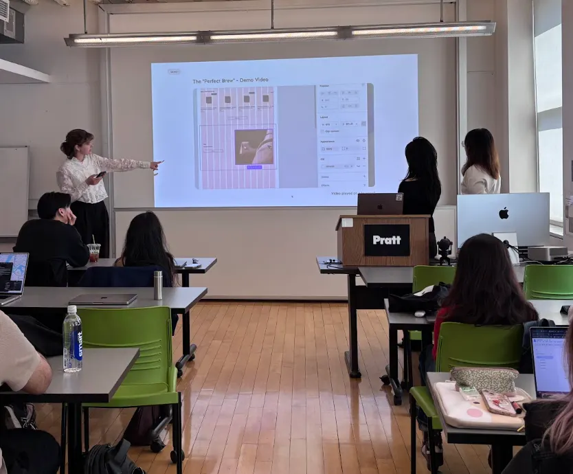
We presented Pour Over to an audience of designers and stakeholders, and the reception was strong. A design system only has value if teams actually use it, so we made the case in terms that mattered to each audience.
- For the product team, faster iteration and less rework.
- For customers, a more predictable and trustworthy experience.
- For the business, a consistent brand and a scalable foundation.
What's next
If this project were to continue, I would want to expand it to include:
- Mobile experience, expanding and testing components for mobile web and native app contexts.
- Code documentation, working with developers to make sure the documentation meets engineering standards, not just design ones.
- Expanding coverage, bringing Blue Bottle's Lab, Learn, and Help Center pages, which remain disconnected from the main site, into the same system.
Thanks for reading!
This project was built alongside Gloria and Mengqi. Design systems turned out to be significantly more work than they appear to be at the outset: building components is one part, but writing documentation is an entirely different part, one that requires sustained thinking about edge cases and the small decisions designers hit every day. Working through those questions taught me how to navigate ambiguity with a systems mindset, making decisions clearly, documenting the reasoning, and building in enough flexibility for the system to evolve without fracturing. A design system is never finished. It's a living structure that reflects a team's shared understanding of what good looks like, and building one with Gloria and Mengqi was one of the most rewarding parts of this project.
Pour Over is an unofficial design system concept created by graduate students at Pratt Institute. It is not affiliated with or endorsed by Blue Bottle Coffee.