How eye tracking revealed hidden usability issues in GT’s Course Builder
An in-person study combining eye tracking, retrospective think-aloud interviews, and usability scoring to uncover why first-time users hesitated, misread the interface, and lost trust in Gutenberg Technology’s AI-powered Course Builder, then turning those findings into design recommendations.
The challenge: a capable AI tool that first-time users didn’t trust
Gutenberg Technology’s Course Builder uses AI to help educators generate entire courses. The content it produced was strong, but GT didn’t know how first-time users were actually reading and interpreting the interface, or where they were getting stuck.
Our research question: how might we guide first-time users through the Course Builder in a way that feels predictable, transparent, and easy to understand?
Research: triangulating eye tracking, think-aloud, and usability scoring
I led the eye-tracking side of the study. We ran eight in-person sessions with first-time users, forty-five to sixty minutes each, and layered several methods so each one could check the others.
Scenario-based tasks. Participants built a college course, then adapted it for elementary school students.
Eye tracking. Tobii recordings showed exactly where attention went, and where it stalled.
Retrospective think-aloud. Participants watched their own recordings back and talked us through what they were thinking.
System Usability Scale. A ten-question survey to put a number on the overall experience.
Users could learn the system, but they couldn’t yet trust it
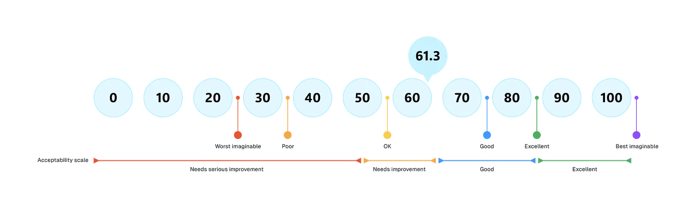
The Course Builder scored 61.3 on the SUS, in the “needs improvement” range. Learnability scored 71.9 while usability scored 58.6: people could figure out the basics, but they hesitated to rely on the tool.
SUS score results
Five moments where users hesitated, misunderstood, or lost confidence
Pairing the eye-tracking recordings with what participants told us afterward surfaced five specific moments in the flow. For each one, we proposed a design change.
Finding 01
Two “New Project” buttons split users’ attention
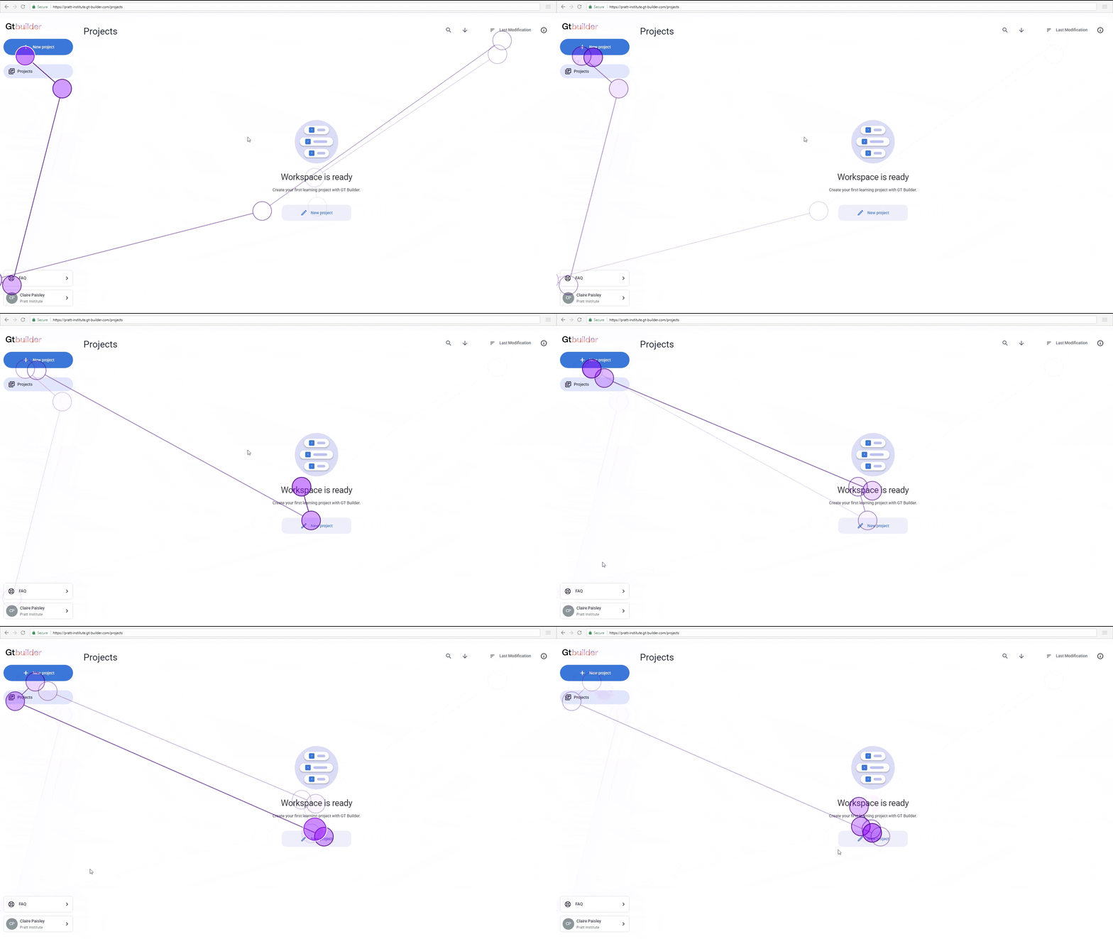
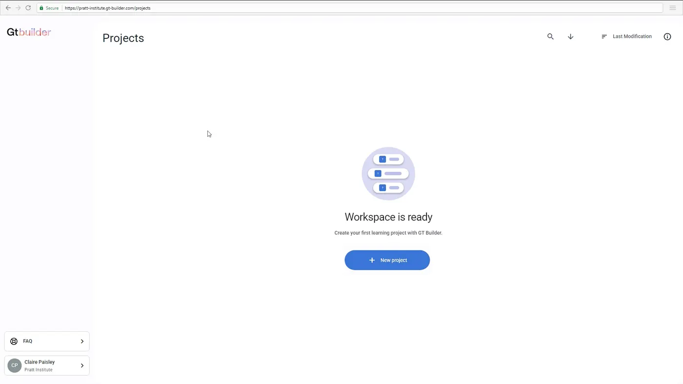
Six of eight participants debated which button would actually create a new project. Eye-tracking showed their gaze jumping back and forth between a button in the sidebar and a nearly identical one in the center of the screen. One participant assumed the sidebar button belonged to a different category altogether.
Eye-tracking recordingProposed redesign
Recommendation: Consolidate to a single, primary “Create New Project” button with a clear plus icon.
Finding 02
Description and Learning Objectives blurred together
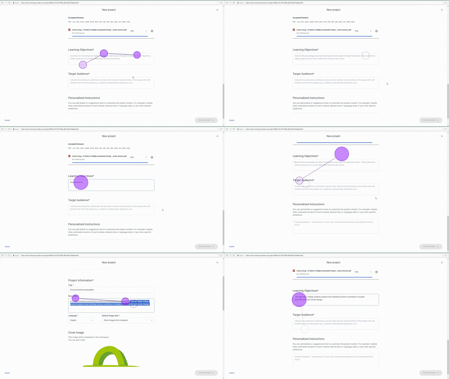
Eye-tracking showed long, repeated fixations bouncing between the Description and Learning Objectives fields. Participants weren’t sure what belonged where, and one admitted they first thought the objectives belonged in the description.
Eye-tracking recordingProposed redesign
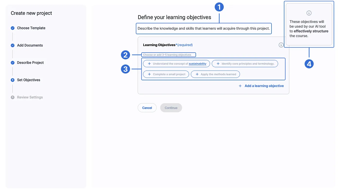
Recommendation: Give every field a stated purpose, length guidance, an example, and a note on how it shapes what the AI generates.
Finding 03
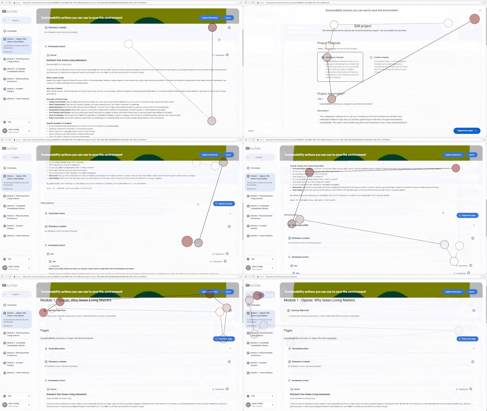
Nobody knew whether “Generate Page” would overwrite their work
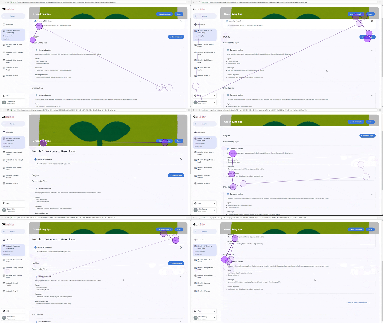
Without a mental model of how outlines, modules, pages, and content relate to each other, participants hesitated before clicking Generate Page. One participant stopped to ask how they could edit the content, and whether they should generate a page at all.
Eye-tracking recordingProposed redesign
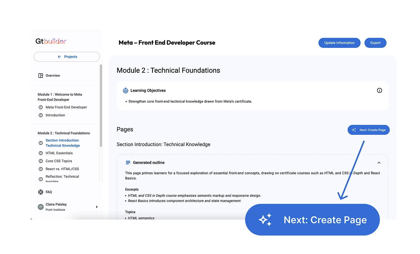
Recommendation: Use step-based transitions, like a “Next: Create Page” prompt, to guide users through an unfamiliar flow.
Finding 04
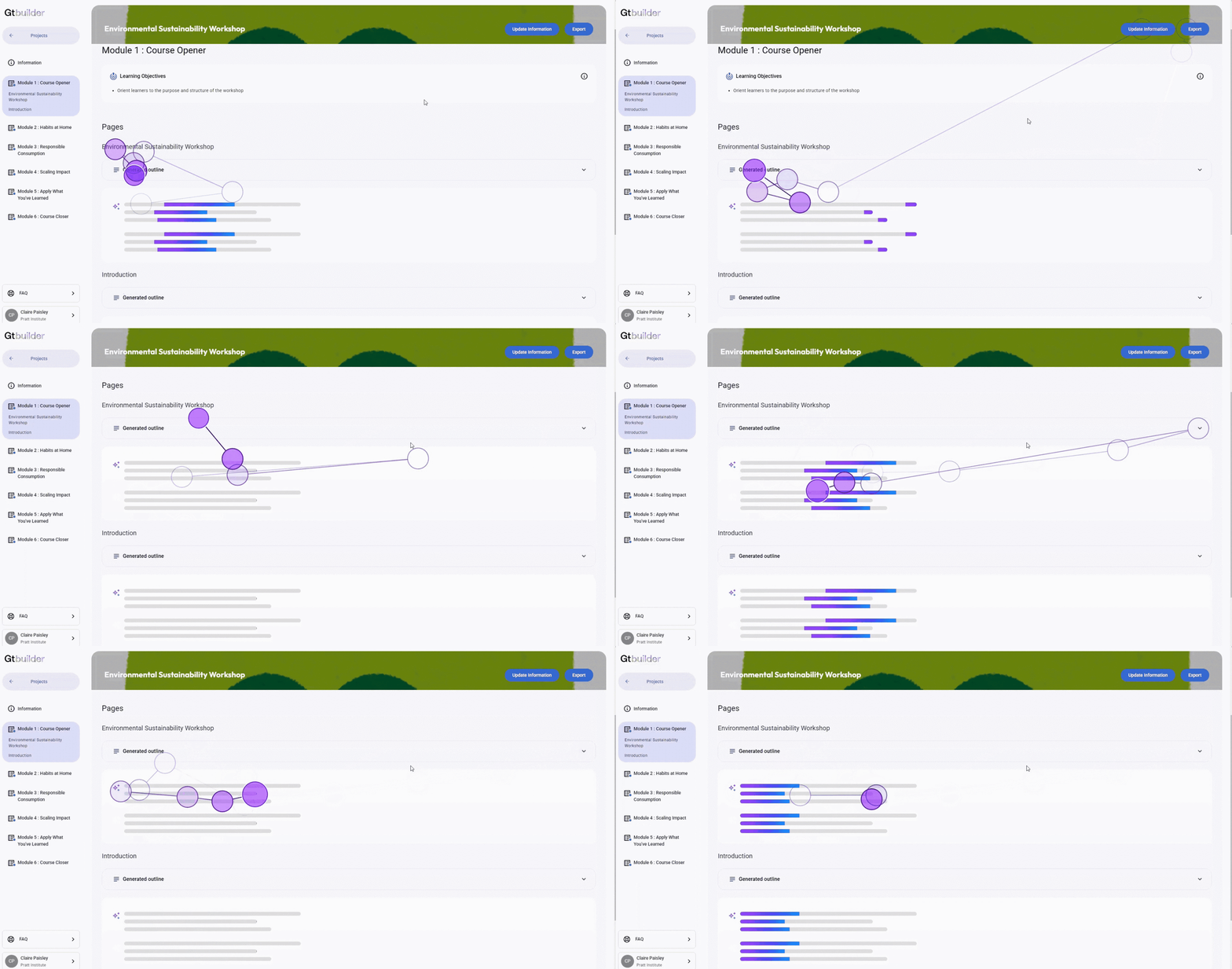
Silence during AI generation read as the system freezing
All eight participants showed signs of anxiety while a module generated. Their eyes wandered across a blank screen with no sign of progress. One participant wondered whether the system was working or frozen, and another asked if they should refresh the page.
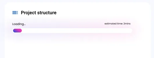
Eye-tracking recordingProposed redesign
Recommendation: Add a loading bar with an estimated completion time and microcopy explaining what the system is doing.
Finding 05
Users couldn’t tell if their work had actually saved
The “Update Information” button left participants unsure whether their edits were saved. One participant said the wording was confusing and that they were looking for some kind of save confirmation. Eye-tracking showed participants backtracking to search for it.
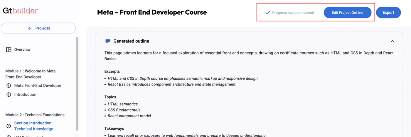
Eye-tracking recordingProposed redesign
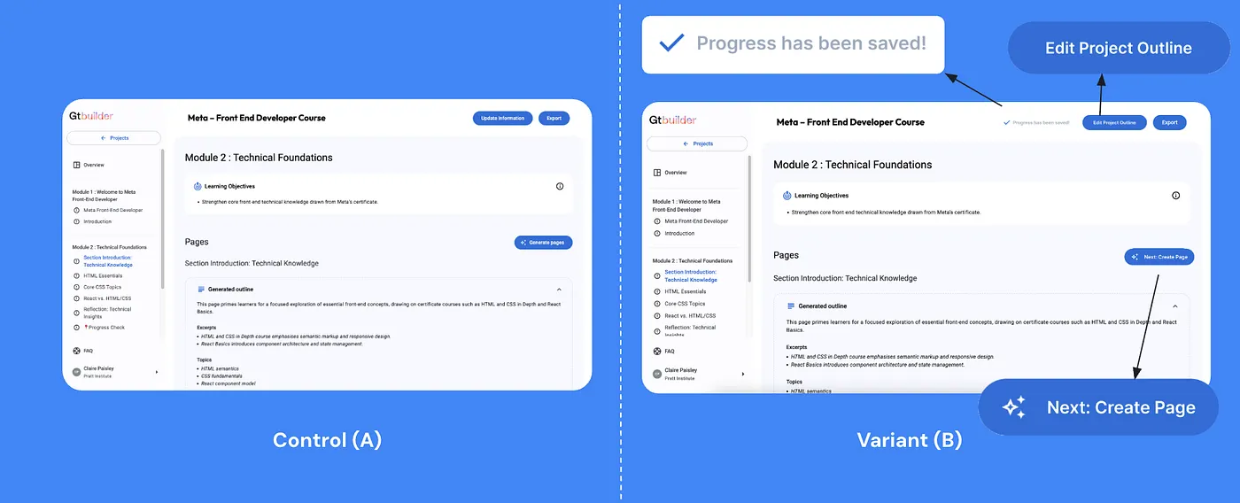
Recommendation: Rename the button to “Edit Project Outline” and add a visible save status indicator.
The pattern across all five: unclear labeling, missing guidance, and too little feedback. When the interface was silent or ambiguous, first-time users lost confidence, even when the AI was working exactly as intended.
Final delivery: presenting findings back to the client
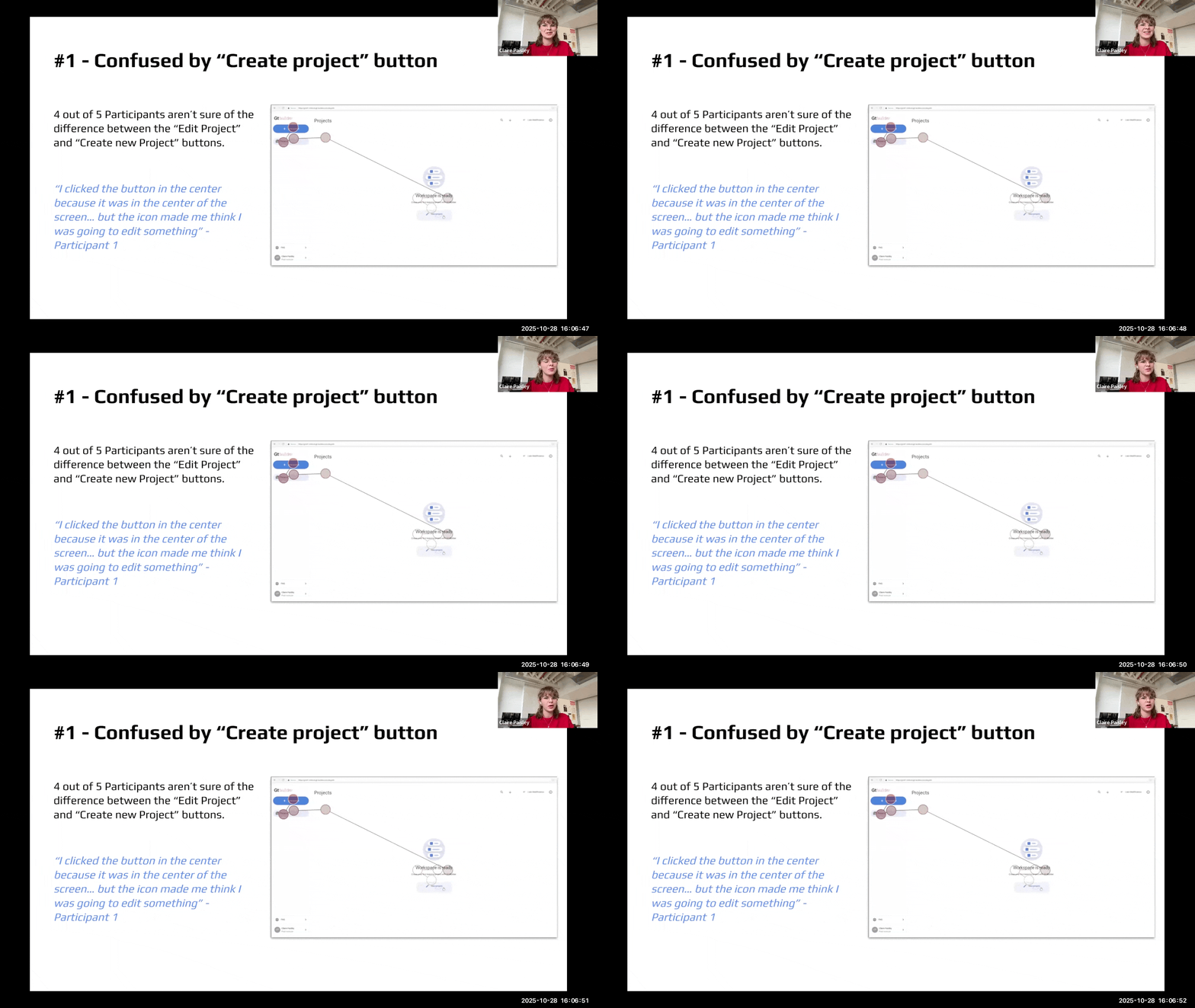
We presented our findings and recommendations to Gutenberg Technology over Zoom. The team told us the eye-tracking insights gave them a level of clarity they had never seen before.
Presenting to Gutenberg Technology
What’s next
The next step would be an A/B test comparing the current interface with the redesign, including the new button wording and save indicator, to measure whether the changes improve clarity and task success.
Proposed A/B test: current vs. redesigned interface
Thanks for reading!
This project was built with Lan-Ting, Jeffery, and Aswathi. Mixed-method research is a growing strength of mine, and this project showed me how well eye tracking and SUS scores pair with task observation and think-aloud interviews. Working with eye tracking also taught me to bring structure to a complex research setup, and I’m proud to have led that part of the project.